|
 The first time I heard about Lo Scarabeo's gay tarot was when I visited them in September 2004. Now the deck
has reached the market. In the accompanying booklet, Lee Bursten states that "as an oppressed minority, often
in danger of losing our jobs, our homes, our freedom, or even our lives because of our sexual identity, I
believe gay men deserve a tarot deck, which can provide a non-threatening venue in which to explore issues of
relationship and how to deal with a society whose attitudes toward homosexuality ranges from indifference to
hostility".
The first time I heard about Lo Scarabeo's gay tarot was when I visited them in September 2004. Now the deck
has reached the market. In the accompanying booklet, Lee Bursten states that "as an oppressed minority, often
in danger of losing our jobs, our homes, our freedom, or even our lives because of our sexual identity, I
believe gay men deserve a tarot deck, which can provide a non-threatening venue in which to explore issues of
relationship and how to deal with a society whose attitudes toward homosexuality ranges from indifference to
hostility".
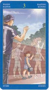
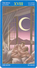 "Gay Tarot" is kept in subdued tones with a very low color intensity, that almost makes it appear as if it was
made in grey tones only, in a drawing style similar to certain comic book stories. It is absolutely
desexualized; those who expect to find sex scenes between male persons will be quite disappointed. At the
most you will see two guys kissing and that on one card only out of 78, the Moon. The characters, of all
ages and from different areas of life (among them the older, well-to-do politician type and the young, black
guy with his skateboard), go through the entire deck. There is also the "caring person", whose mark is a
turned around cap. Females are - almost - quite left out of the deck, except that the caring person (a main
character in one of the stories told) is seen with the same small girl on several cards - could be his
daughter - and on one card, the 3 of Wands, he is waving goodbye to a group which, besides the small girl,
includes a grown-up woman and a boy (his former family, perhaps). While the small girl is rendered in soft
colors as all other characters are, the woman and boy are transparent, as if they were only imaginary. This
detail can, of course be interpreted in several ways, like much of the scenery can. My general impression of
the deck is one of sadness and loneliness and an eternal longing after a different life. That is probably
not what it is meant to express, but that is how I see it anyway. When I first looked through the cards,
I found them rather boring, but a closer look revealed many interesting stories. It is a more profound deck
than it immediately appears to be. A contrast to the general, everyday life situations depicted on most cards
are the traditional queens, which here are substituted by "guides" in the form of winged angels.
"Gay Tarot" is kept in subdued tones with a very low color intensity, that almost makes it appear as if it was
made in grey tones only, in a drawing style similar to certain comic book stories. It is absolutely
desexualized; those who expect to find sex scenes between male persons will be quite disappointed. At the
most you will see two guys kissing and that on one card only out of 78, the Moon. The characters, of all
ages and from different areas of life (among them the older, well-to-do politician type and the young, black
guy with his skateboard), go through the entire deck. There is also the "caring person", whose mark is a
turned around cap. Females are - almost - quite left out of the deck, except that the caring person (a main
character in one of the stories told) is seen with the same small girl on several cards - could be his
daughter - and on one card, the 3 of Wands, he is waving goodbye to a group which, besides the small girl,
includes a grown-up woman and a boy (his former family, perhaps). While the small girl is rendered in soft
colors as all other characters are, the woman and boy are transparent, as if they were only imaginary. This
detail can, of course be interpreted in several ways, like much of the scenery can. My general impression of
the deck is one of sadness and loneliness and an eternal longing after a different life. That is probably
not what it is meant to express, but that is how I see it anyway. When I first looked through the cards,
I found them rather boring, but a closer look revealed many interesting stories. It is a more profound deck
than it immediately appears to be. A contrast to the general, everyday life situations depicted on most cards
are the traditional queens, which here are substituted by "guides" in the form of winged angels.
 One detail I find annoying, not only with this deck but in many others, is that what used to be a standard
for tarot number cards, the appropriate number of suit marks incorporated in the design, has more or less
disappeared. At best the suit-marks are so intricately incorporated, that you have to look closely to find
them. We have to depend on the title to see what card it actually is. Often the illustrated situation does
not respond to the actual card's traditional meaning either. From time to time I get the feeling that the
illustrations were made for another purpose and just edited loosely for the deck.
One detail I find annoying, not only with this deck but in many others, is that what used to be a standard
for tarot number cards, the appropriate number of suit marks incorporated in the design, has more or less
disappeared. At best the suit-marks are so intricately incorporated, that you have to look closely to find
them. We have to depend on the title to see what card it actually is. Often the illustrated situation does
not respond to the actual card's traditional meaning either. From time to time I get the feeling that the
illustrations were made for another purpose and just edited loosely for the deck.
 I wondered about the statement of Lee Bursten, that started this review. In my part of the world, like in
many other Western countries, male homosexuality is no longer suppressed. On the contrary. Gay people
promote themselves and their lifestyle limitlessly through parades and in many other visible ways.
I wondered about the statement of Lee Bursten, that started this review. In my part of the world, like in
many other Western countries, male homosexuality is no longer suppressed. On the contrary. Gay people
promote themselves and their lifestyle limitlessly through parades and in many other visible ways.
|
